Display Settings allow you to control the appearance of your category slider. After finishing Category Settings and Slider Settings, use this section to match the slider’s style with your site’s design. Most options require the premium version for full customization.
Controlling Visibility Elements
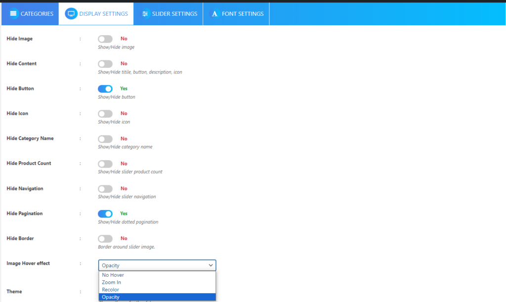
The first group of options lets you show or hide different parts of your slider. You can toggle any element to “Yes” to hide it entirely from your visitors.
Want a cleaner look? Hide the slider image by toggling the Hide Image option. If you prefer text-only sliders, use Hide Content to remove the title, button, description, and icon all at once. For a more minimal approach, you can selectively hide just the button, icon, category name, or product count by toggling their respective hide options. The Hide Border option removes the frame around your slider image for a seamless appearance.
Adding Visual Effects
Your slider images can come alive with hover effects that engage your visitors. Choose from four different hover behaviors: No Hover keeps things static, Zoom In creates a magnifying effect when someone hovers over the image, Recolor starts with black and white images that burst into color on hover, and Opacity adds an elegant shadow effect.
Styling Your Slider
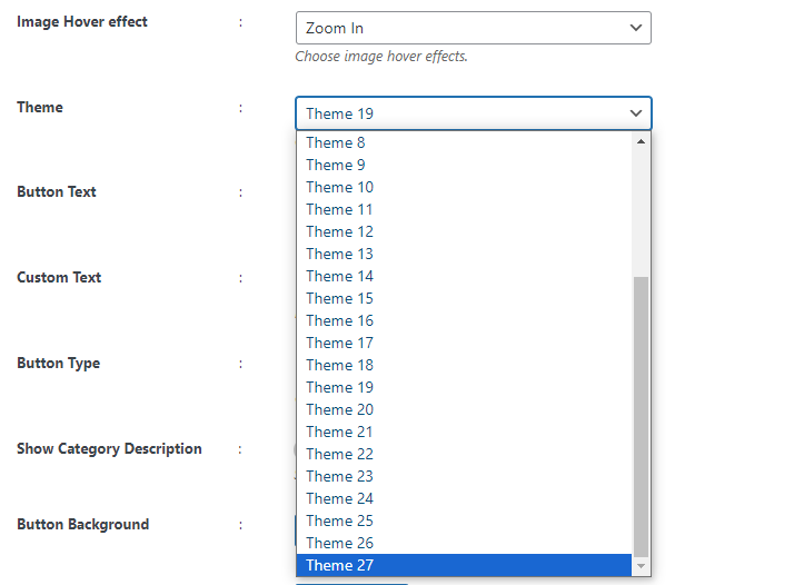
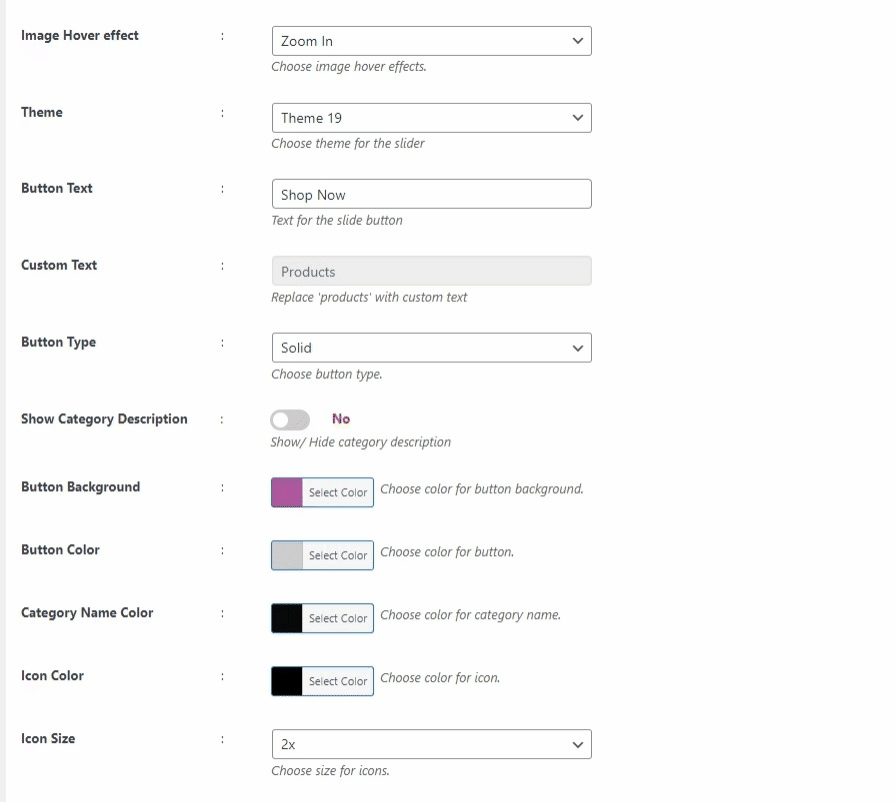
The theme selector offers 27 professionally designed templates, including Basic and Default options. Once you’ve chosen a theme, you can customize the Button Text to match your call-to-action needs. The Custom Text field allows you to add personalized messaging anywhere on your slider.
Button styling gives you control over both appearance and behavior. Choose between Solid buttons for bold statements or Transparent buttons for subtle integration. The Show Category Description toggle lets you include detailed information about each category.
Color Customization
Every text and background element can be colored to match your brand. Set your Button Background and Button Text Color to create the perfect call-to-action. The Category Name Color, Icon Color, Description Color, Product Count Color, and Children Category Color options ensure all text elements coordinate beautifully.
Your Content Background Color creates the foundation for your slider’s appearance, while Border Color and Border Hover Color add finishing touches. The Border Width can be precisely controlled by entering a pixel value.
Technical Customization
Icon Size selection from the dropdown menu ensures your icons fit perfectly with your design. The Image Size option allows you to select from predefined dimensions that best suit your layout.
For advanced users, the Custom CSS field provides unlimited styling possibilities. Here, you can add any custom code to achieve unique visual effects that aren’t available through the standard options.
To complete your slider configuration, you’ll also want to review your Font Settings to ensure typography matches your overall design.
Next Step
After configuring your Display Settings, your category slider is ready to be published on your website. Consider configuring different Slider Settings combinations to optimize performance.