Over 65% of your online sales are directly linked to the visibility of your product categories. Since category images are the key to successful store navigation, your product categories always need particular attention. If you are a newbie who has just started with an online store, you must learn how to deal with your product categories to grab the attention of your audience.
The difference between a product image and a category image is that the latter is more abstract and requires some logic to make its meaning crystal clear. A strong concept for category images is a must if you want to make your website look appealing. Keeping that in mind, one has to showcase product categories in such a way that customers would love to click on them.
To make a category page look more professional and attractive, let’s talk about a few image suggestions.
✔️Take Great Photos
Product photography should be the top priority to attract visitors to a website. You need to make sure the images of a product look similar to the real product. Also, you need to standardize the color of an image, maintaining product size, focal point, background light, and so on.
✔️Use Large Images
To let your customers quickly understand what you want to sell and what you want to show in detail, you need to use large-sized images. If larger images are used, they look perfect on the retina screens. Provided that, large images with a width of at least 650px are recommended. But 1000 px is always the best choice. The images you are using can be taken either from your smartphone or from a professional camera. As long as the photo represents your products in the best way with a good resolution, you are good to go.
✔️Synthesize Style
The stylization of category images should be determined in such a way that customers do not get confused. In that case, one should prepare category pictures unified by one and the same background and perspective. This technique will lead your customers to what they want without a second thought.
✔️Keep Proportions
If you want to make your storefront look more professional, you need to keep the same proportions to improve the navigation. Your category pictures should be either horizontal or vertical but never both. The proportions you have selected should be set in terms of the theme you have chosen for your site. Therefore, it’s quite hard to say what will be a better option for you, but if you want, you can use the square format.
✔️Create a Relevant Image
The purpose of sharing category images with visitors is to help your customer to navigate your store so that customers can get attracted and stick to your site. To ensure that, you need to choose pictures that reflect a direct meaning to the visitors and it would take only a second for the visitors to decide where to go next.
✔️Unify Images
You don’t need to go too extreme in stylizing your product category images. You need to get off your high horse and be straightforward as well as simple. But you need to deploy category images in the same perspective so it seems coherent to the visitors. If the background and the light used in the pictures are kept similar and rationalized properly, it would help to convince customers to stay on the site.
Essential Elements of Product Category Pages

Visitors who come to product category pages are basically researchers. They are looking for options in essence and want to know what you are offering. Since they are looking for specific products, product category pages significantly play a vital role. Keeping up this idea, the contributor should provide the visitors with the information they are looking for from “research” to “purchase”. You need to mention what they need to know about this category page and what exactly this page is about.
Filtering
If you want to refine your interest, category filtering can be a great option for passive users and for you, to boost conversions in your store. Among the various categories within your store, you have to be very selective in choosing categories to display on the page. You must have to choose the best product category that would come up in the first place. The rest will be set in terms of popularity, interests, Product views, etc.
Product Category Name
You must choose unique product category names regarding your prospects. It is not a must to choose an esoteric name. But you have to keep in mind that whatever you are doing is nothing but getting attention from the customer out of nothing. A perfect and easy name not only helps the customer know your categories but helps the search engines key in as well.
Category Price Range
Based on your product category, you can define price ranges at the category page level under the category images to the qualified shoppers. It will also prevent customers’ disappointment. Defining the category price range gives shoppers the option to choose the price that fits best with their budget. Some may think the strategy will decrease the number of visitors but we also know that well-informed customers are always the happiest customers.
Category Ratings
Category ratings can bring extra value at the product category level. If you add category rating options below the category images, it will catch the eye of the visitors. Basically, visitors bump into such products that are good in quality and the quality of a product or its category can be reflected with the help of ratings.
Featured Items

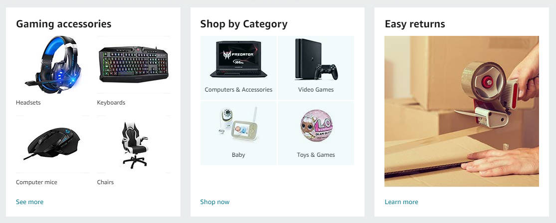
While you are showcasing your categories on a page, you are actually featuring them to grab your visitors’ attention. Therefore, category images on a page should be clear and on point. You can consider the strategy followed by Amazon. You can use multiple images sliding within the category image box. The featured images used inside the category image box should be chosen in terms of popularity, number of sales, and views.
Know the Purpose of your Category Images
Every page on a website has its own purpose. Your job is to grease them all and to know how a customer would think and how to make them glide effortlessly to the place you want. A clean product category page can cement the sale and it can be an intersection where visitors can choose a direction. Although it doesn’t provide everything in detail a glimpse, it will move your customer in the direction you want.
To obtain the purpose of the category image –
- Should be easily recognizable
- Must not draw attention to itself, create a clear point on product categories
- Understand the niche
- Use the picture of the best sellers
- Pile up a bunch of your products of the same category and take a shot
Design for Customers, Not for own fulfillment
Product category images work like road signs. One thing you need to keep in mind is what the visitors need to know to go along with the site journey. There are many renowned websites that process their sales with the help of category images. To improve your ideas on the category page and to know how to use images effectively, you can visit those sites and deploy them in the same way. If you have better plans according to your niche, you are good to go.
Best Way to Visualize Category Images on WordPress Site
There are many categories showcasing plugins that you will find on the WordPress platform. These plugins depict your selected categories and subcategories in an appealing way. To draw customers’ attention, these plugins help to highlight categories in a sliding manner. The following two plugins cover most of the category image showcasing features-
WooCommerce Category Slider

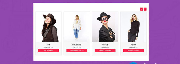
WooCommerce Category Slider gives you an opportunity of showing WooCommerce product categories and subcategories in a slider. The categories will be shown in a modern-looking and descriptive slider that will show the details of the category.
Features
- Product category and subcategory slider
- Easy shortcode copy/paste
- Show name, number of products in a category, details of a category
- Fontawesome icon support
- Gutenberg block support
- Hover effect and show/hide navigation
- Autoplay and responsive
- Lightweight and fast loading
- Color customization for content, content background, border, button, button background column
- Custom image size, column size
- Custom CSS class
- Slider loop support
- Exclude any categories you can also try the free version of WooCommerce Category Slider to check its cool free features.
WooCommerce Category Showcase

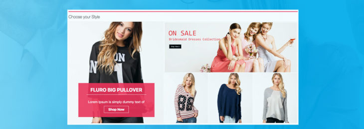
WooCommerce Category Showcase is another WooCommerce product category show-window plugin that shows categories in a nice block. The best feature of this plugin is, that you can feature categories with additional categories. Featured categories will be shown inside a nice and fancy slider with category names & descriptions whereas additional categories will be in a nice six blocks with category names and descriptions.
Features
- Category and subcategory slider
- Featured category and additional category option
- Slider autoplay and hover effect
- Show category names and descriptions
- Shortcode copy/paste functionality
- Customize image size, title, title color, content background, button, and button background
- Hide/show button and description
- Hide/show category name
Thank You for visiting PluginEver and reading this article! We really appreciate You. Let us know if You find it helpful!

Leave a Reply
You must be logged in to post a comment.