Let’s break the ice! Online retailers should pay close attention to the UI design of their WooCommerce stores. Along with other store optimizations, because it has a major impact on both store performance and customer satisfaction.
With more and more retailers catching on to the platform’s incredible potential for revenue growth, WooCommerce has become a fiercely competitive eCommerce platform in its own right. Accordingly, in order to succeed in today’s market, brands need to put substantial resources into their e-commerce platforms.
“User interface design” (UI design) is the process of developing websites’ user interfaces in a way that satisfies both the user’s needs and their aesthetic preferences. The way in which a product’s user interface (UI) is constructed is crucial to the product’s success or failure. Because it determines how customers will interact with and navigate the product.
Now is the time to take a closer look at the UI design of your WooCommerce store if you want it to stand out from the crowd. By following the steps outlined in this manual, you’ll be able to put together a user interface (UI) for your online store that is both modern and effective in 2024 and beyond.
Let’s jump right into the comprehensive manual, shall we?
What is WooCommerce UI Design?
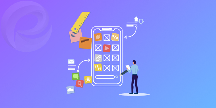
In simple terms, UI stands for User Interface, which is the visual appearance of a website or a mobile app. UI illustrates the design and layout of a website to the users and defines their interaction with the app.
The process by which designers create interfaces to enhance the usability of a WooCommerce store is called WooCommerce UI Design. In this process, UI designers mainly focus on the looks and styles of online store presence with the purpose of enhancing user experience (UX).
UI Design can be considered invaluable for WooCommerce businesses since it plays an important part in delivering a pleasant and seamless online shopping experience to customers. Creating a well-designed user interface involves following specific guidelines to ensure ease of understanding and use.
Evaluate content, optimize information hierarchy, adjust visuals, consider contrast, define space, be mindful of forms and controls, test usability, and customize for different platforms. Once the design process is complete, it should be thoroughly tested to ensure maximum usability.
Importance of Good UI Design

A well-designed user interface (UI) is crucial to giving users a positive and easy experience. Essential components of effective UI design include well-structured menus, straightforward directions, and attractive visuals.
Effective user interface design boosts digital product success by making it more appealing to its target audience. However, it is also important to consider how quickly customers can find the information they need, as poor interface design can result in lost sales of any type of product.
In the context of WooCommerce stores, user interface design is crucial because it has a direct effect on whether or not a customer makes a purchase. An intuitive user interface (UI) can simplify and streamline the shopping experience for the customer.
The customer’s satisfaction with the store and the likelihood that they will make a purchase are both boosted by this. However, sales can be negatively affected by cart abandonment and overall poor user experience caused by a poorly designed UI.
Not only can a poorly designed user interface have a negative effect on sales, but it can also hurt your WooCommerce store’s credibility and trustworthiness. Having faith in a store’s security and reliability is crucial, especially when dealing with money.
A positive impression of the brand and increased customer loyalty are two additional benefits of good UI design. All things considered, a well-designed user interface is crucial to the success of your WooCommerce store.
Key Elements of Effective UI Design in WooCommerce

There are three key elements to make up an effective UI Design in WooCommerce that online merchants should pay close attention to:
1. Input Controls
Input controls are interactive elements of the interfaces, including all elements that allow users to enter information into the system. Some of the main Input control elements that can be mentioned are:
- Checkboxes
- Text fields
- Hover elements
- Lists
- Buttons
2. Navigational Elements
When it comes to UI Design, navigational elements refer to a set of actions guiding the users around the WooCommerce shop. In order to easily browse throughout the store page, customers can rely on some navigation components such as:
- Menu and breadcrumbs
- Search options
- Image carousels
- Sliders
- Tags and icons (social media integrations)
You can use Category Slider for WooCommerce & Category Showcase for WooCommerce plugin to beautify your WooCommerce store
3. Informational Components
Informational components are used to share relevant information with customers. These elements can sometimes be used to provide customers with guidelines to help them understand unfamiliar objects in the store interface.
Some key informational components are:
- Push notifications
- Pop-up message boxes
- Modal windows
- Progress bars
Once these elements are incorporated effectively, they can greatly enhance the store page interface and support WooCommerce businesses in delivering a world-class shopping experience.
WooCommerce UI Design Best Practices
As stated above, a distinguished WooCommerce UI design involves various elements. It requires a considerable amount of research and trial that highly depends on the business niche and potential customer group.
However, there are some particular factors in UI design that WooCommerce stores should take into consideration when it comes to UI development.
1. Store Navigation
The first thing to keep in mind when you want to enhance your WooCommerce user interface is to present simple navigation that guarantees uninterrupted consideration of customer purchases.
Customers should be able to browse through different product pages and reach the checkout screen without any hindrance.
In order to do so, store navigation options should be improvised to best ensure smooth movement from one step to the next:
- The main menu should be clean and appealing that contain essential categories.
- Sub-categories should be included in the drop-down list and automatically displayed when the cursor hovers over the category.
- The search bar is a navigation element that is always available to provide shortcuts to different product types. An AI-powered search bar to recommend what buyers are looking for is a smart choice.
2. Home Page
The home page of any WooCommerce store is probably the most crucial and creative area in UI design as this is the first thing that grabs customers’ attention when they land on your WooCommerce stores.
Therefore, homepage design should focus on immediately highlighting your brand and services in a few seconds. All the related information such as business goals, product bestsellers, brand partners, and testimonials should be displayed in an informative eye-catching, and professional way.
3. Product Page
Every product page should aim at giving customers a full understanding of the product they are looking at. To improve Product Page UI Design, WooCommerce stores can:
- Enable the zoom-in/zoom-out functionality of the product images.
- Display product descriptions and product images in carousel mode.
- Include product videos, a size chart, and a product reviews section.
It’s worth noticing that all pertinent details, including discount codes, payment options, extra fees, or return policies shall be shown at once on product pages.
However, these pieces of information should be made small on non-intrusive widgets to free up the product pages to primarily focus on product details.
4. Checkout Screen
Normally, there are two checkout screen options, which fit everything into one page and break the checkout process into several pages.
A major benefit of one-page checkout is its accessibility and convenience, as everything customers need to make the final purchasing steps is there.
However, it also leads to an overwhelming of information packed on only one page, which might make customers find it sophisticated to complete all needed elements at once.
Therefore, WooCommerce businesses might benefit more from a multi-page checkout design option. Breaking down the entire process into two to three screens can minimize the probability of the customer making a mistake or skipping some information.
There are several feature-wise elements that should be included in the Checkout Screen to motivate customers to finish their orders:
- Multiple payment options
- Money-back guarantee policy
- “Add to wishlist” button
5. Mobile Responsive Design
In 2022, mobile traffic was responsible for 60.28% of all total global e-commerce traffic, meaning that more than half of store online traffic came from smartphones. Therefore, mobile responsive design has become the top priority of any online retail business for the last few years.
For a practical mobile responsive design, UI designers need to conduct detailed research on which devices, screen sizes, and web browsers are most prevalent today before making a final design plan.
Keep in mind that responsive design isn’t simply about making your store page fit any user device, it’s about optimizing the design to match the capabilities of the device hardware as well as the device resolution.
Benefits of WooCommerce UI Design
1. Excellent User Experience
The most noticeable advantage of WooCommerce UI design is to significantly leverage user experience. The fact that customers can fully enjoy a seamless shopping process will encourage them to purchase more and return to your WooCommerce stores in the future.
An excellent UI design is normally demonstrated in a responsive store design. This allows WooCommerce stores to automatically adjust to fit different device screen sizes. Regardless of which device customers are using, the shopping page presence remains consistent, which provides a smooth shopping experience.
2. Higher Conversion Rate
65% of customers stated that they would become long-term customers of a brand if they experienced a positive and smooth customer journey. Therefore, excellent UI design is the first step on the shopping journey that later vastly increases customer conversion rates.
Online Retail merchants with better WooCommerce UI Design can apparently generate more sales and gain an increasing competitive advantage over other companies in the market.
3. Reduced Cost & Time
Proposing a well-planned UI Design from the start can avoid certain future problems. This includes fixing navigation errors, eliminating non-relevant functions, or adjusting the design to be accessible and functional.
Therefore, a good WooCommerce UI Design assists WooCommerce store owners in saving time and effort in the long run.
Recap Creating User-Friendly & Intuitive UI Designs
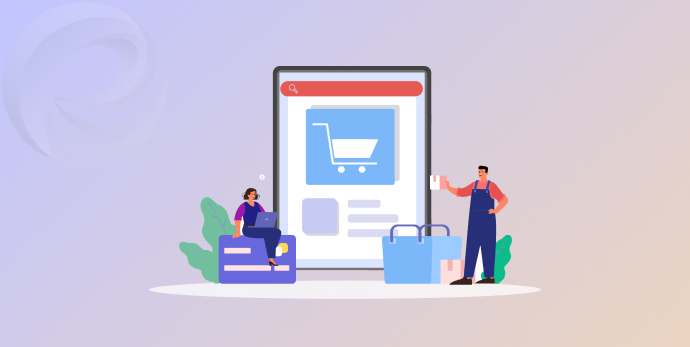
Creating user-friendly and intuitive UI designs requires a clear understanding of user needs and objectives. It involves a systematic process of sketching, designing, testing, prototyping, and refining to ensure the product meets usability standards.
Attention to detail is critical in this process as small elements can have a drastic impact on user experience. A solid foundation in design fundamentals also helps produce effective results.
Utilize Eye-Catching Imagery & Color Schemes
Visual appeal is extremely important when crafting a stylish and contemporary WooCommerce store design that customers will love. To make your store stand out, consider utilizing bold colors and graphics to create eye-catching imagery.
Think outside of the box and try out various color combinations to find the perfect palette for your WooCommerce store. Additionally, use high-definition (HD) images of your products on display to captivate customers with attractive visuals.
Enhance Customer Experience with Helpful Navigation Features
Customers want their WooCommerce store experience to be as fluid and effortless as possible.
Utilizing navigation features ensures customer satisfaction such as breadcrumb trails that lead customers back through the purchasing process, a sticky header that follows them even when scrolling, product filters for more specific products, and auto-complete search bars that display the products customers are looking for faster.
Incorporate The Latest Technology & Trends
In order to keep your WooCommerce store up-to-date, it’s essential to stay on top of the latest technologies and trends in the industry.
A few features that may be worth exploring include 3D product modeling with 360-degree photo galleries and interactive custom product displays, AI chatbots for customer service, mobile optimization for seamless user experience across any device, voice activation for faster shopping, and more.
Design for Mobile & Responsive Shopping Experiences
Nowadays, customers are using their smartphones to do online shopping. It’s important to make sure that your WooCommerce store design follows the latest trends in mobile optimization.
Look for features such as fast-loading pages, optimized images and navigation, touch-friendly menus, and responsive checkout forms. This will make it easy for customers to shop on any device. Mobile optimization will also help you stay competitive in the market. By doing so, you can deliver your customers a more seamless shopping experience.
Streamline The Checkout Process
In 2024, customers will expect a speedy and uncomplicated checkout process. Narrow down the checkout process by removing unnecessary fields such as fax number and address line 3.
Additionally, choose an appropriate payment gateway to ensure security and create a trustful environment. Finally, set up a ‘quick checkout’ option to make it easier for customers to purchase multiple items without having to complete the same information each time.
Wrap Up
WooCommerce store UI design is a valuable asset to vastly enhance your business performance. Enhanced WooCommerce UI Design not only delivers a seamless user experience but also increases customer engagement and conversion rates.
For that reason, it’s mandatory for WooCommerce business owners to understand the importance of UI Design. Every WooCommerce store owner continually upgrades their WooCommerce store presence to enormously improve customer satisfaction.
Stay tuned with us for more informative articles about the WooCommerce store.
Adios!
Leave a Reply
You must be logged in to post a comment.