This guide explains how to choose the best layout for displaying your product categories. Each layout offers a different way to organize and present categories on your site.
Before you begin, review the Creating Your First Showcase guide to understand the basic setup process.
Available Layout Types
Slider Layout – Dynamic & Interactive
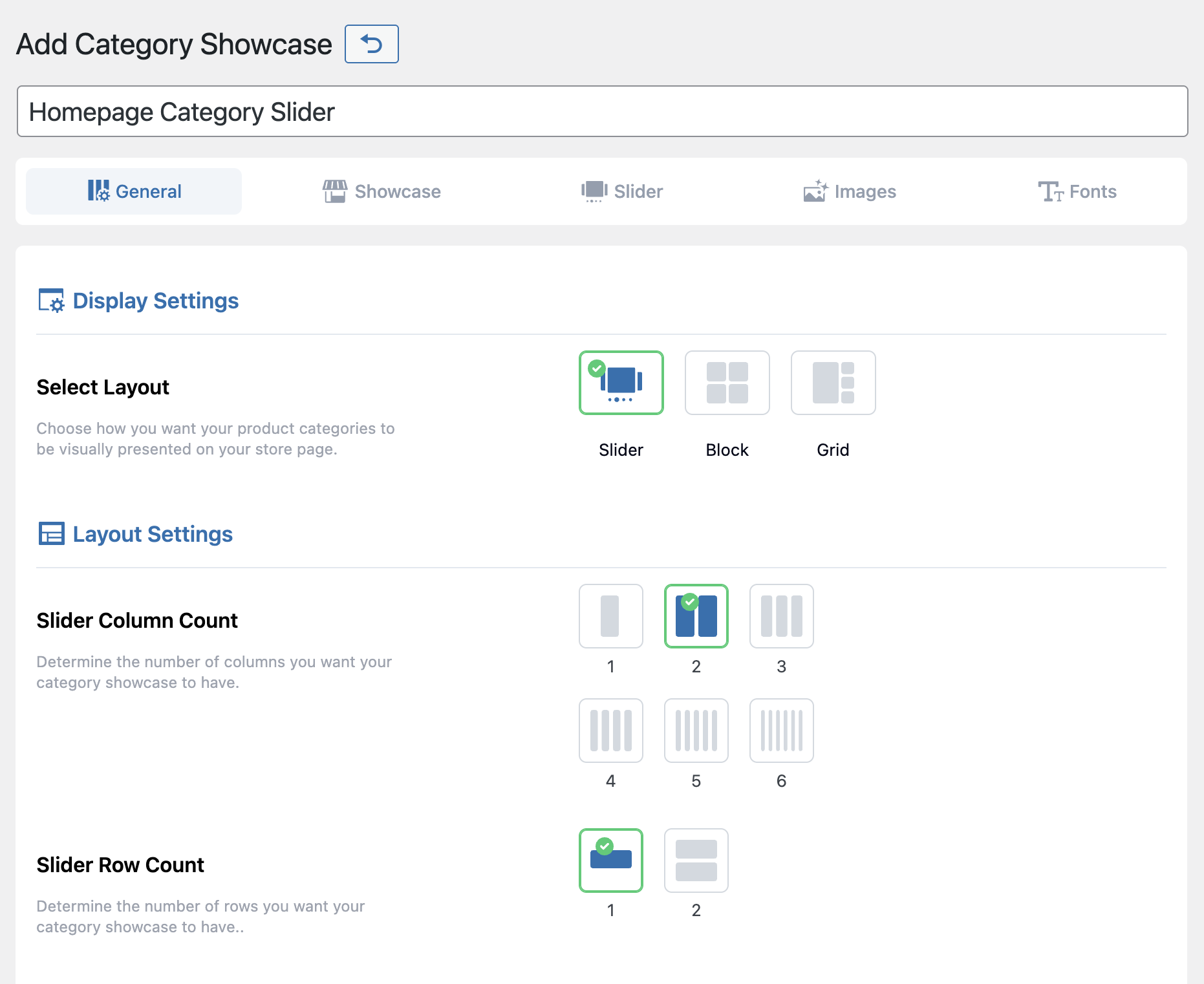
The Slider layout is ideal for homepages or areas with limited space. It includes horizontal scrolling, navigation arrows, autoplay, and touch control. This layout works best for dynamic displays, large numbers of categories, and promotional content.
Block Layout – Clean & Simple
The Block layout provides smooth horizontal scrolling with a clean design and minimal interface. It adapts well to different screen sizes and fits sites that prefer simple, distraction-free navigation.
Grid Layout – Organized & Fixed
The Grid layout displays all categories at once in fixed rows and columns. It offers clear structure, responsive design, and strong mobile optimization. Use it for shop pages or collections with a small number of categories.
Key Features
Slider Layout: Includes autoplay, navigation arrows, ticker mode, and touch support.
Block Layout: Offers simple scrolling and a minimal interface.
Grid Layout: Provides multiple layout templates, fixed positioning, and automatic mobile stacking.
Switching Layouts
You can switch layouts at any time without losing your existing showcase.
- Open the showcase you want to edit.
- Go to Display Settings > Select Layout.
- Choose a new layout and adjust its related settings.
- Click Update to save.
Next Step
Once you’ve selected a layout, you can explore the category selection guide to choose the right categories to display.