The Block layout gives your store a clean, organized look while keeping each category neatly separated. It’s best suited for stores that prefer a balanced, content-driven layout where images, titles, and buttons align vertically for clarity and visual simplicity.
Follow this guide to build your Block Showcase step by step.
Step 1: Prepare Your Category Images
Start by setting category images that fit well within a block structure. Each image should represent its category clearly and match the overall tone of your store.
Full guide here: Preparing Category Images
Use square or uniform-sized images to maintain consistent alignment.
Step 2: Create a New Showcase
Go to Category Showcase → Add New Showcase.
Give your showcase a title, such as “Shop by Category”.
If you’re new to this, follow: Creating Your First Showcase

Step 3: Choose the Block Layout
Open the Layout Selection section and select Block Layout.
This layout displays categories in stacked blocks with room for descriptive text and buttons.
Learn more about all available layouts: Layout Selection
Step 4: Select Categories to Include
Under the Category Selection on the same tab, choose which categories you want to display in your Block Showcase.
You can display all categories or pick only selected ones.
Detailed guide: Category Selection
Step 5: Configure Titles and Descriptions
Each block includes space for a title and a short description.
Use this to help customers understand what each category offers.
Setup instructions: Title & Description Settings
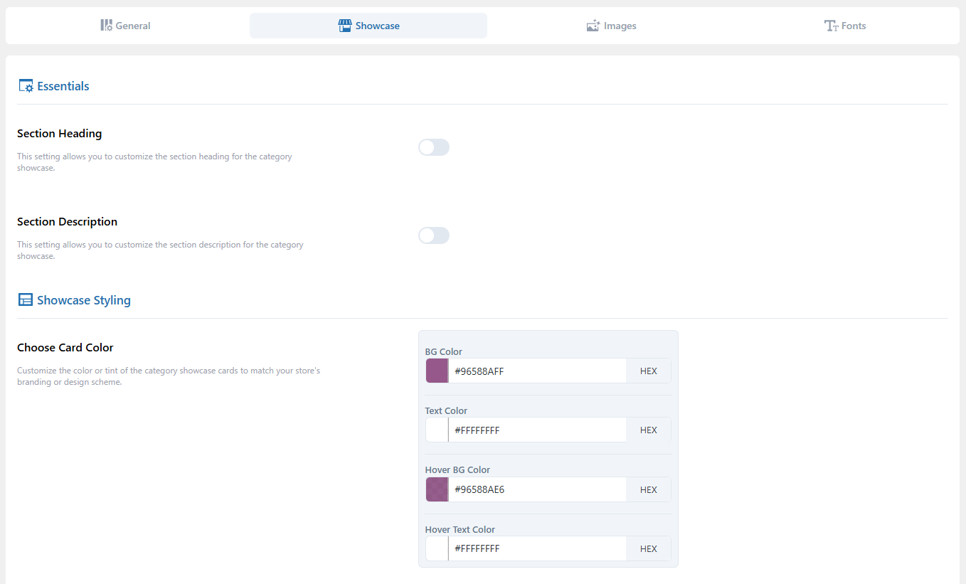
Step 6: Customize Category Cards
Category cards define how each block looks.
Adjust border style, padding, hover color, and alignment to match your site’s design.
Guide: Category Card Settings
Step 7: Adjust Showcase Display Settings
To ensure your blocks display neatly across devices, visit Showcase Display Settings.
Here you can manage spacing, alignment, and how many blocks appear per row.
Full guide: Showcase Display Settings
Step 8: Adjust CTA Buttons
Open Button Style Settings to design your “View Products” or “Shop Now” buttons.
See guide here: Button Style Settings
Step 9: Adjust Images
In the Image Settings tab, configure how your category images appear—size, alignment, and hover behavior.
See guide: Image Settings
Step 10: Set Fonts and Typography
Typography plays a major role in readability.
You can modify font family, size, and color from the Fonts Settings tab.
Detailed instructions: Fonts Settings
Step 11: Publish and Review
When you’re done customizing, click Publish.
Visit the page where your shortcode or block is placed and test your slider.
If images or layouts don’t update properly, check: Category Images Not Updating in Showcase