The Slider layout lets you display product categories in a dynamic carousel that captures attention. It’s ideal for highlighting featured or seasonal categories while saving space on your homepage or landing pages.
Follow this step-by-step guide to set up your slider showcase from start to finish.
Step 1: Prepare Your Category Images
A smooth slider starts with quality visuals. Make sure each category has a clear image that fits your brand style.
You can add or edit images directly from the product category settings in WooCommerce.
Learn how here: Preparing Category Images
Use images of equal size for consistent slide transitions.
Step 2: Create a New Showcase
Go to Category Showcase → Add New Showcase.
Name your showcase and save it as a draft so you can configure it step by step.
If you haven’t created one before, review: Creating Your First Showcase
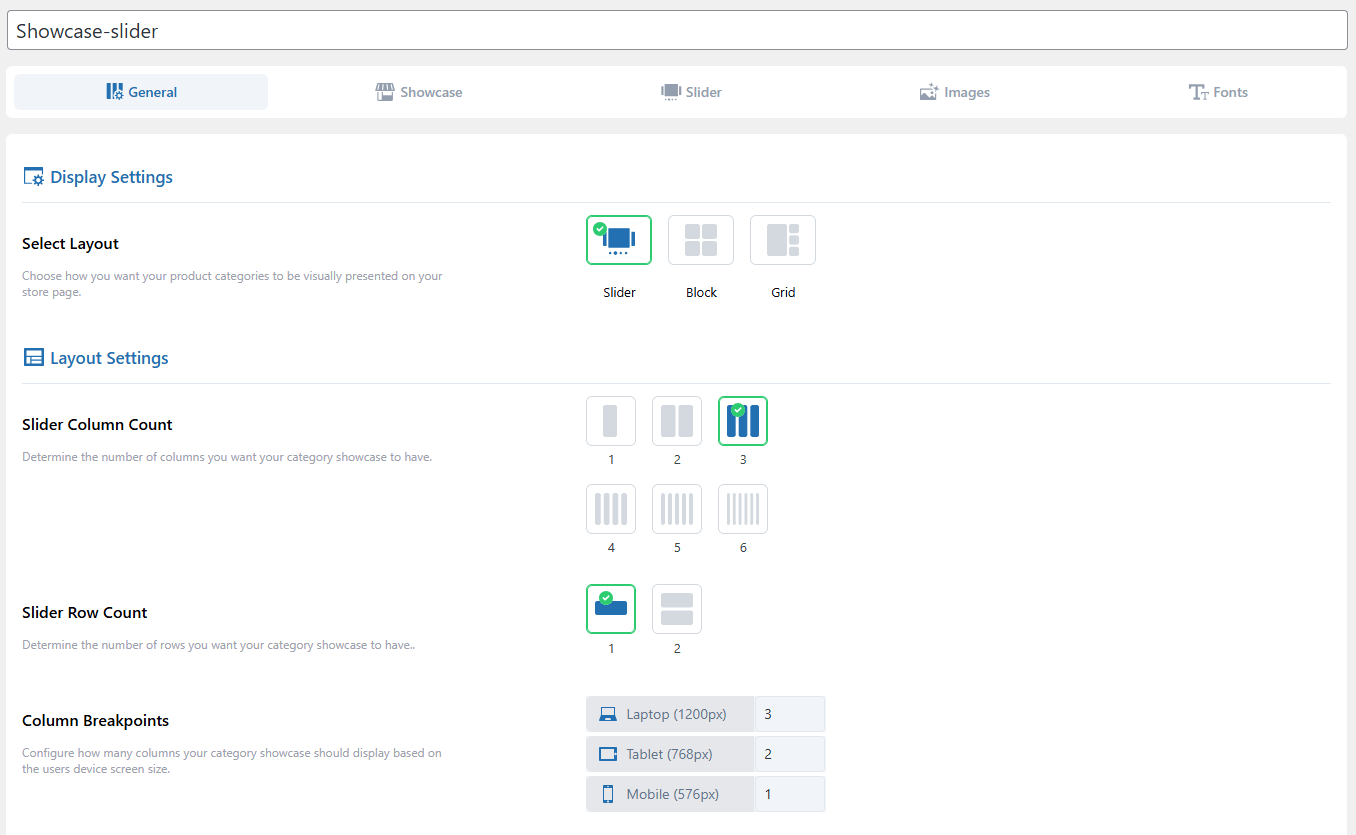
Step 3: Select the Slider Layout
Open the Layout Selection section and choose Slider Layout.
This layout displays categories in a horizontal carousel that customers can swipe or navigate with arrows.
See more about available layouts: Layout Selection
Step 4: Choose Categories to Display
Move to the Category Selection section.
You can display all categories or pick only selected ones. You can also set additional categories, as they display beside the main slider.
Learn the full process: Category Selection
Step 5: Add Titles and Descriptions
Titles and short descriptions make each slide informative.
You can show or hide them, control their alignment, and adjust text length for a cleaner appearance.
Detailed settings here: Title & Description Settings
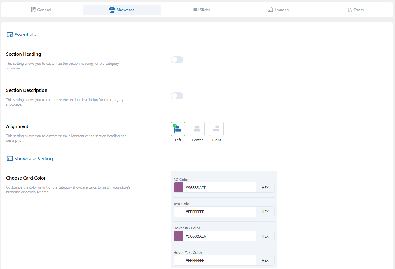
Step 6: Design Your Category Cards
Each slide is a category card.
You can adjust its border, shadow, hover effects, and spacing to fit your layout.
More details: Category Card Settings
Step 7: CTA Button Styling
Visit Button Style Settings to customize your call-to-action buttons.
See guide: Button Style Settings
Step 8: Configure Slider Behavior
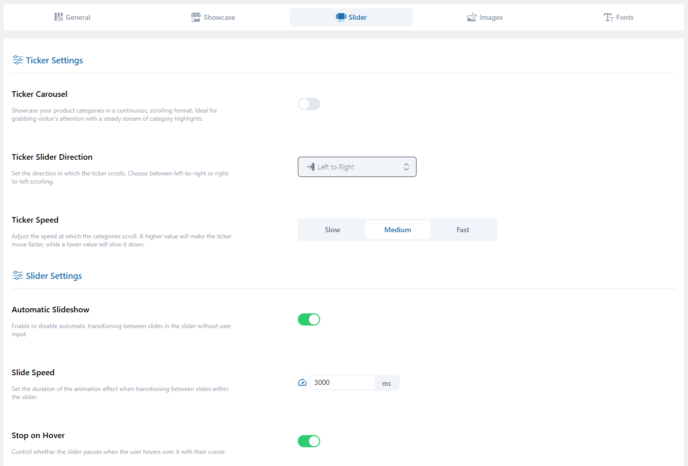
This is where the slider comes alive.
Go to the Slider Settings tab and set:
- Autoplay: Automatically cycle through slides.
- Speed: Control how fast each slide changes.
- Direction: Choose left-to-right or right-to-left scrolling.
- Navigation Controls: Enable arrows or dots for navigation.
Full guide: Slider Settings
Step 9: Adjust Image Styling
In the Image Settings tab, control how category images appear in the slider—set aspect ratio, cropping, or zoom effects.
See guide: Image Settings
Step 10: Fine-Tune Typography
If your slider includes text, ensure it’s readable and visually balanced.
You can change font type, size, and color from the Fonts Settings tab.
Learn more: Fonts Settings
Step 11: Review Display Settings
Before publishing, open the Showcase Display Settings to confirm grid spacing, responsiveness, and alignment.
Even in a slider, these settings help maintain balance across devices.
See guide: Showcase Display Settings
Step 12: Publish and Test
When you’re satisfied, click Publish.
Visit the page where your shortcode or block is placed and test your slider.
If any category image or layout doesn’t appear correctly, check: Category Images Not Updating in Showcase