How to Configure the Grid Showcase
This guide walks you through configuring the Grid Showcase feature for product categories on your store page. This flexible layout lets you visually highlight product categories using customizable grids with various design and functional settings.
General Settings
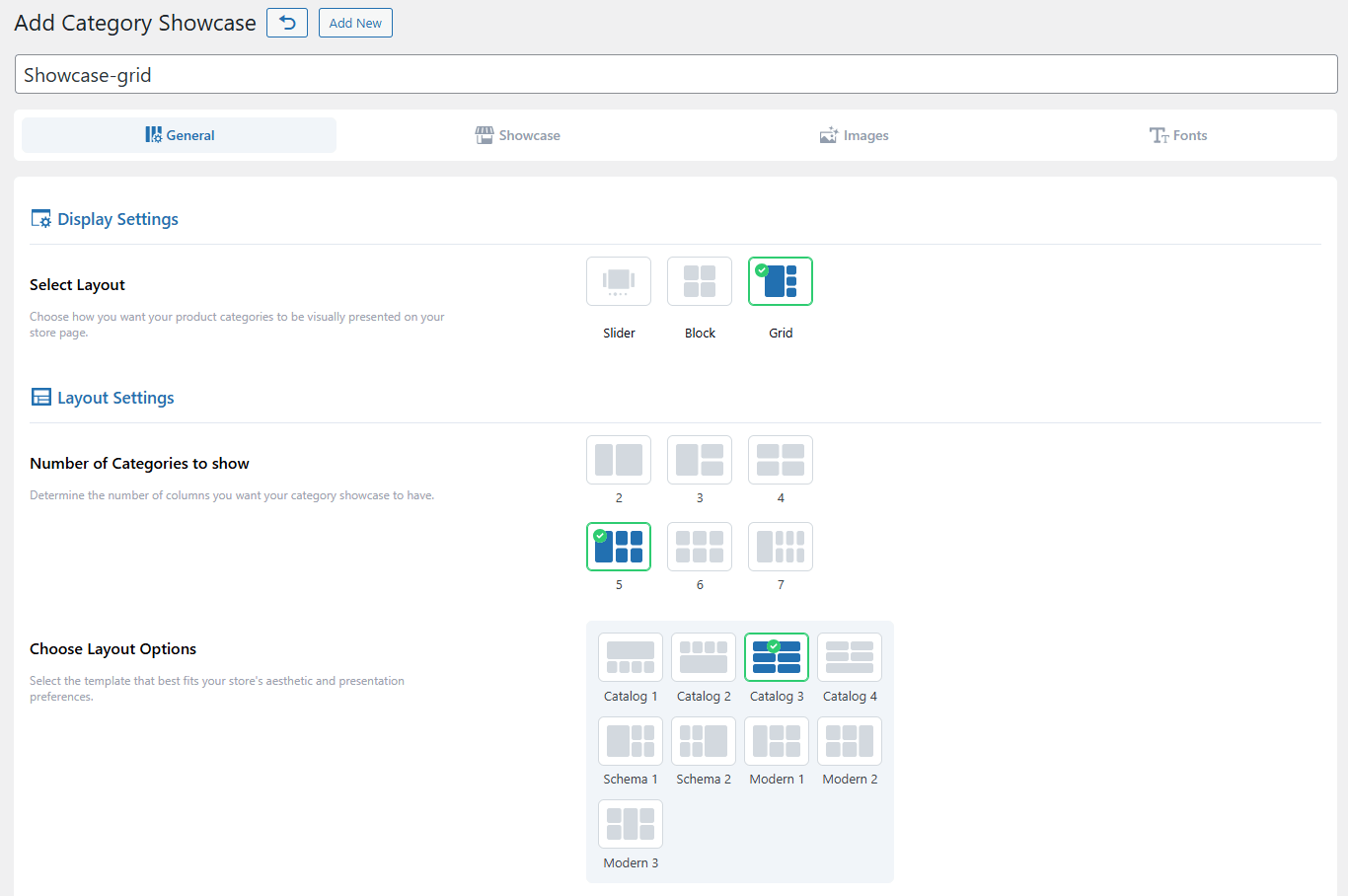
Display Settings
Select Layout
Choose Grid from the available layout types: Slider, Block, and Grid.
Layout Settings
Number of Categories to Show
Select how many columns the grid will contain.
Choose Layout Options
Pick a template that fits your design preferences.
Category Selection
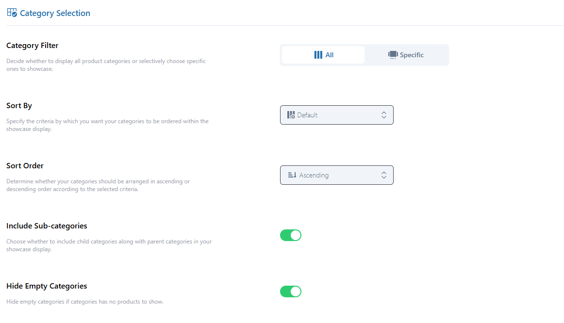
Category Filter
The Category Filter allows you to control which product categories are displayed in the showcase. You can choose between two filtering options:
All: When selected, this option will include all available product categories in the showcase automatically. No manual selection is required.
Specific: Selecting this option enables you to manually choose which categories you want to display. Only the selected categories will be shown in the showcase, giving you more granular control over the content.
Sort By
Choose how the categories are sorted (e.g., Name, Date, Category ID).
Sort Order
Choose between ascending or descending order.
Include Sub-categories
Toggle ON/OOF to show/hide child categories.
Hide Empty Categories
Toggle ON/OOF to exclude/include categories with no products.
Showcase Settings
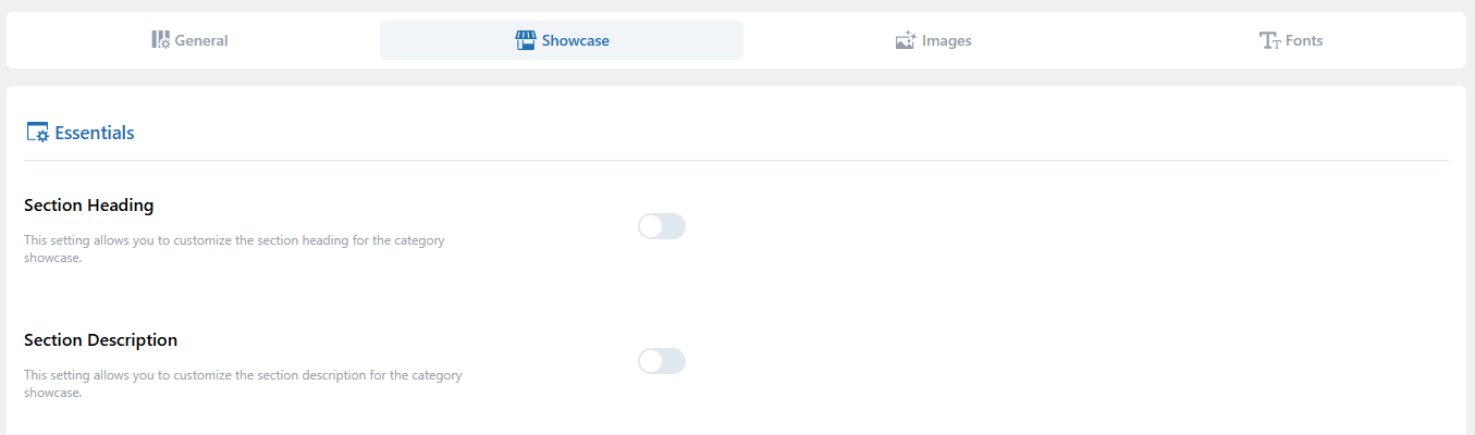
Essentials
Section Heading
Enable the toggle and add a heading.
Section Description
Enable the toggle and write a description for context.
Showcase Styling
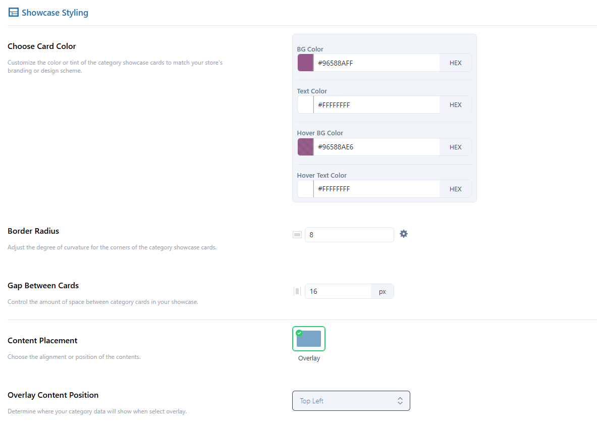
Choose Card Color
Use the color picker or enter a HEX code to set the color for Background Color, Text Color, Hover Background Color, and Hover Text Color.
Border Radius
Set the corner curvature of cards (in pixels). Use the settings icon to control each corner independently.
Gap Between Cards
Define the spacing between category cards (in pixels).
Content Placement
Set this to Overlay for modern layout styling.
Overlay Content Position
Choose where the overlayed content (title, button, etc.) should appear on the card (e.g., Top Left, Center Center, etc.).
Content Padding
Set padding between the card content and its edge (in pixels). Use the settings icon to control each side independently.
Content Inner Color
Use the color picker or enter a HEX code to set the color for BG Color, Text Color, Hover BG Color, and Hover Text Color.
Content Inner Padding
Set padding for the overlay content (in pixels). Use the settings icon to control each side independently.
Category Showcase
Use toggles to turn ON/OFF the following elements:
Categories Image: Show/hide images for each category.
Categories Icon: Display/hide icons alongside or instead of images.
Category Title: Show/hide the name of the category.
Category Description: Display/hide the category description.
Product Quantity: Show/hide the total number of products per category.
Sub-categories Product Quantity: Show/hide product counts for sub-categories.
Custom Text: Add additional details, such as “Price Range” or “Category Information.”
Button Style
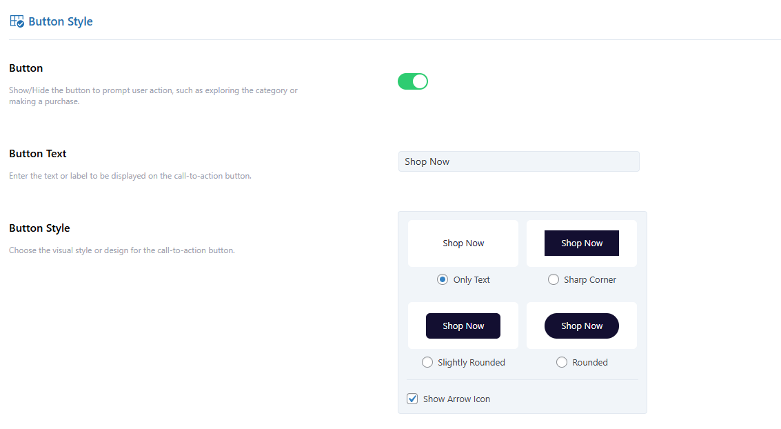
Button
Toggle to enable a call-to-action button on each card.
Button Text
Customize the button label (e.g., “Shop Now”, “Explore”).
Button Style
Choose from predefined styles.
Arrow Icon: Uncheck this box if you do not want to display the arrow icon within the button.
Button Colors
Customize the appearance by using the color picker or entering a HEX code to set the colors for BG Color, Text Color, Hover BG Color, Hover Text Color, Border Color, and Border Hover Color.
Images Settings
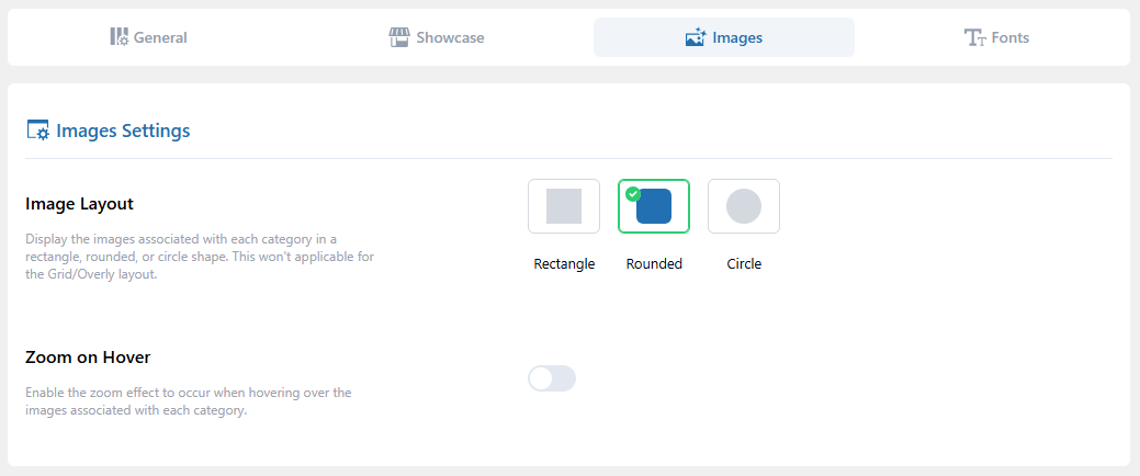
Image Layout
Choose a layout from: Rectangle, Rounded, or Circle.
Zoom on Hover
Toggle ON/OOF to enable image zoom on hover.
Fonts Settings (Pro Feature Only)
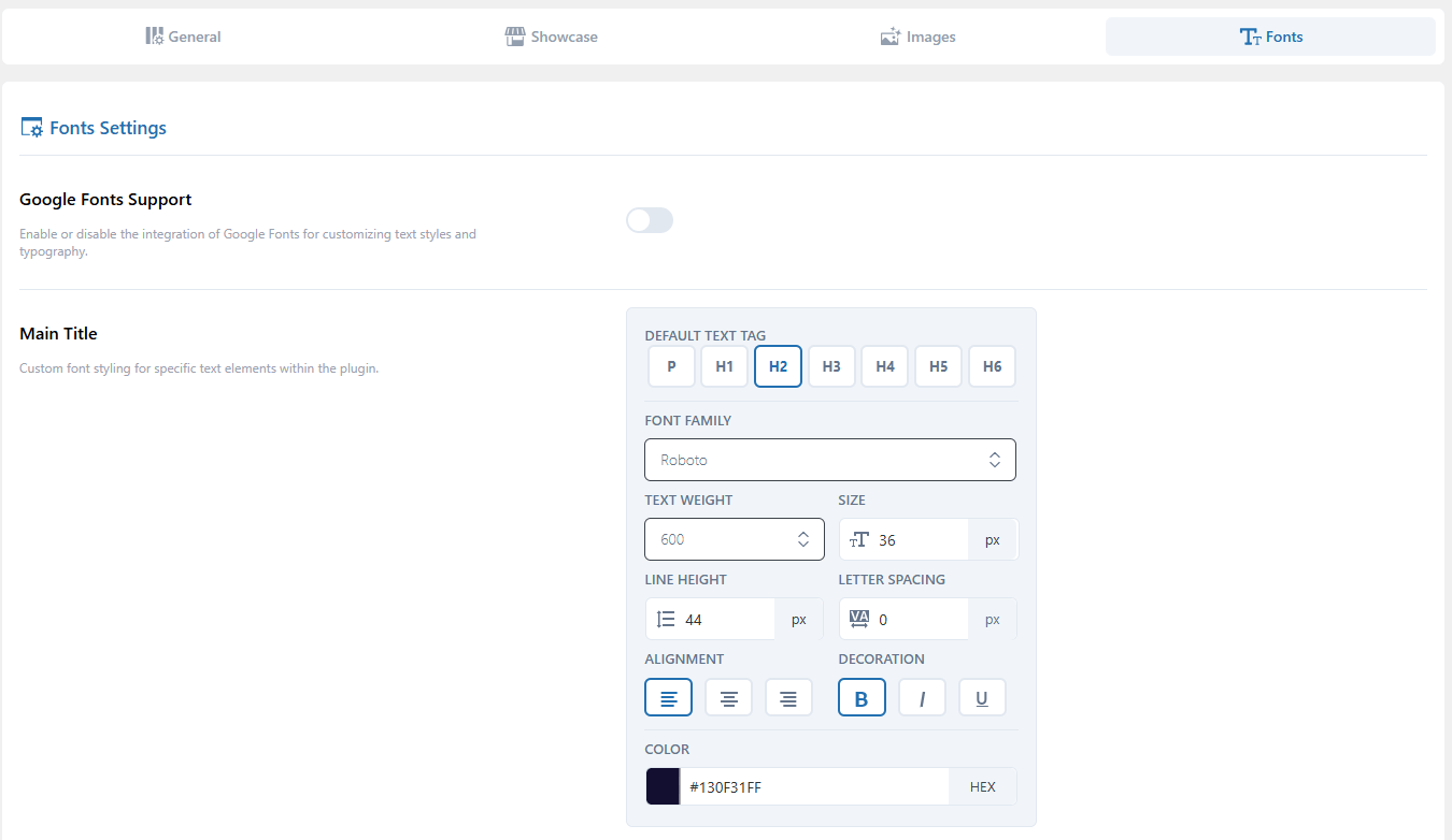
Google Fonts Support
Toggle ON/OOF to enable/disable custom typography using Google Fonts.
Main Title & Category Title
Customize the font styling for the Main Title and Category Title with the following options:
Text Tag: Choose HTML tag (e.g., P, H1, H2).
Font Family: Select your preferred font.
Text Weight: Set font weight (e.g., 100, 400, 700).
Size: Define size in px.
Line Height: Adjust spacing between lines.
Letter Spacing: Control spacing between characters.
Alignment: Align text (left, center, right).
Decoration: Add bold, italic, or underline.
Color: Set text color via color picker or enter a hex code.