Button Style Settings control the appearance and behavior of the call-to-action button displayed on each category card. These options help you create consistent, visually clear interactions across all layouts.
Before adjusting button styles, review the Font Settings section to ensure your typography aligns with your overall design.
Button Display Overview
This section explains how to enable and customize the call-to-action button used in each category card. You can activate the button, define its text, and select from available style options to suit your site’s layout.
To configure the settings, go to the Showcase tab while creating a showcase.
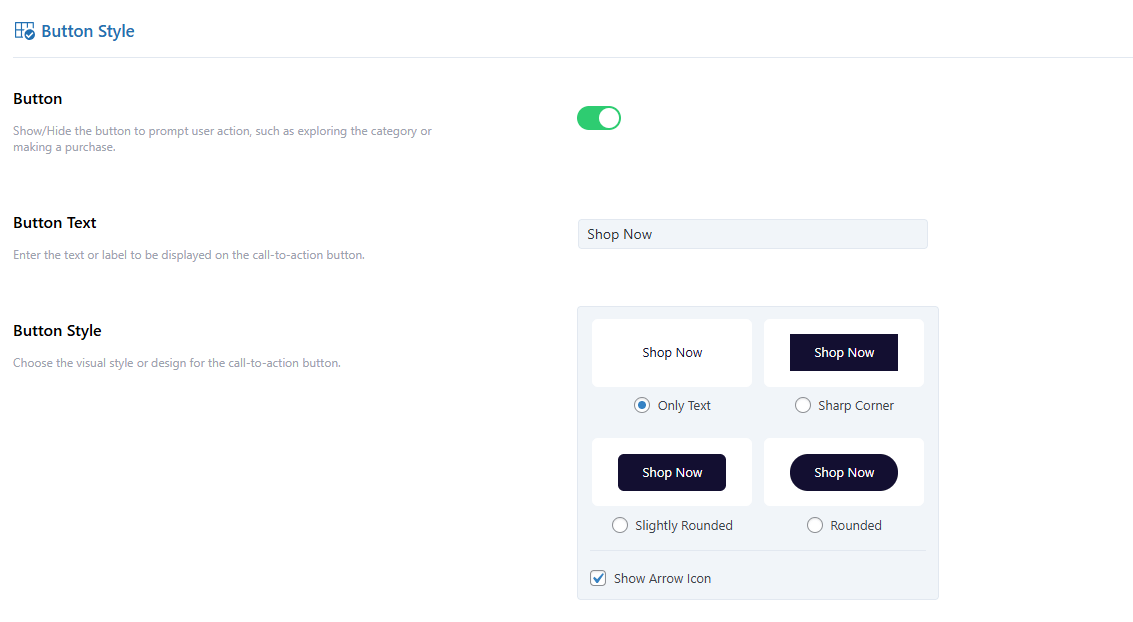
Button
Toggle ON to display a call-to-action button on each card, or OFF to hide it.
Button Text
Set the label for your button. Common examples include “Shop Now,” “View More,” or “Explore.”
Button Style
Choose a predefined button style that fits your theme.
If you do not want to display an arrow icon, uncheck the Arrow Icon option.
Button Color Settings
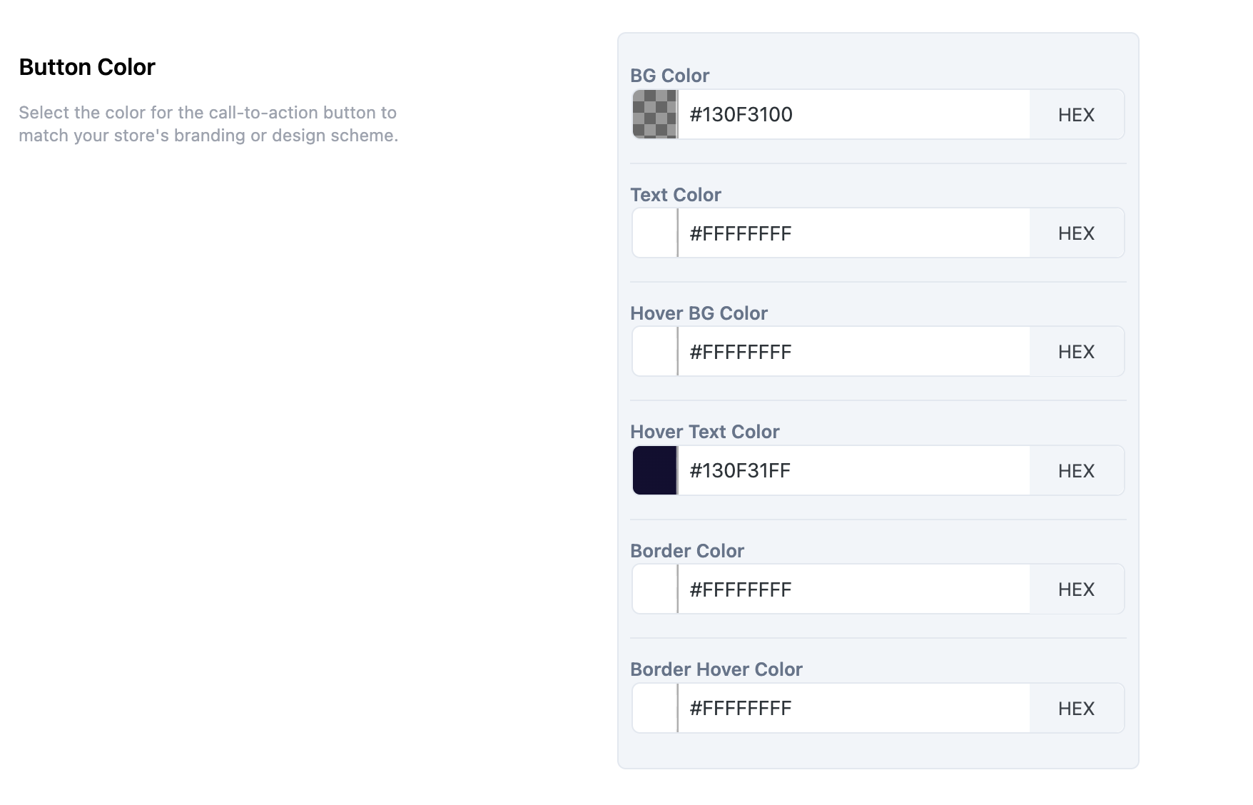
Customize the button’s appearance using the color picker or by entering HEX codes. You can define individual colors for the following elements:
- Background Color
- Text Color
- Hover Background Color
- Hover Text Color
- Border Color
- Border Hover Color
Next Step
Once your button styles are configured, proceed to the Advanced Settings section to explore additional layout and display customization options.