This guide explains how to configure your showcase and control its visual style.
If this is your first showcase, please read Creating First Showcase before continuing. Once the showcase is ready, you can set the Title and Description that appear in the display.
Showcase Styling
Customize the overall look and feel of your showcase cards using the following options.
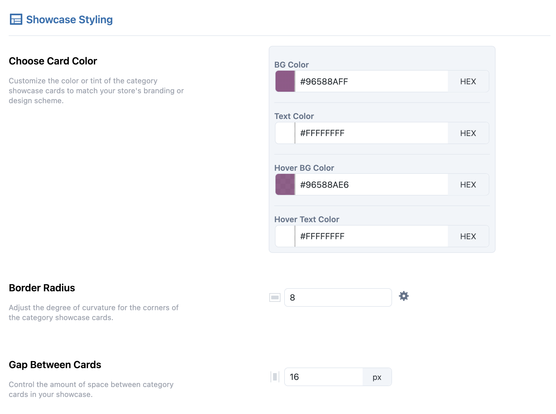
Card Appearance
Use the color picker or enter HEX codes to set the Background, Text, Hover Background, and Hover Text colors.
Border Radius
Define how rounded the card corners appear. Use the settings icon to adjust each corner individually.
Gap Between Cards
Set the space between cards in pixels for proper visual balance.
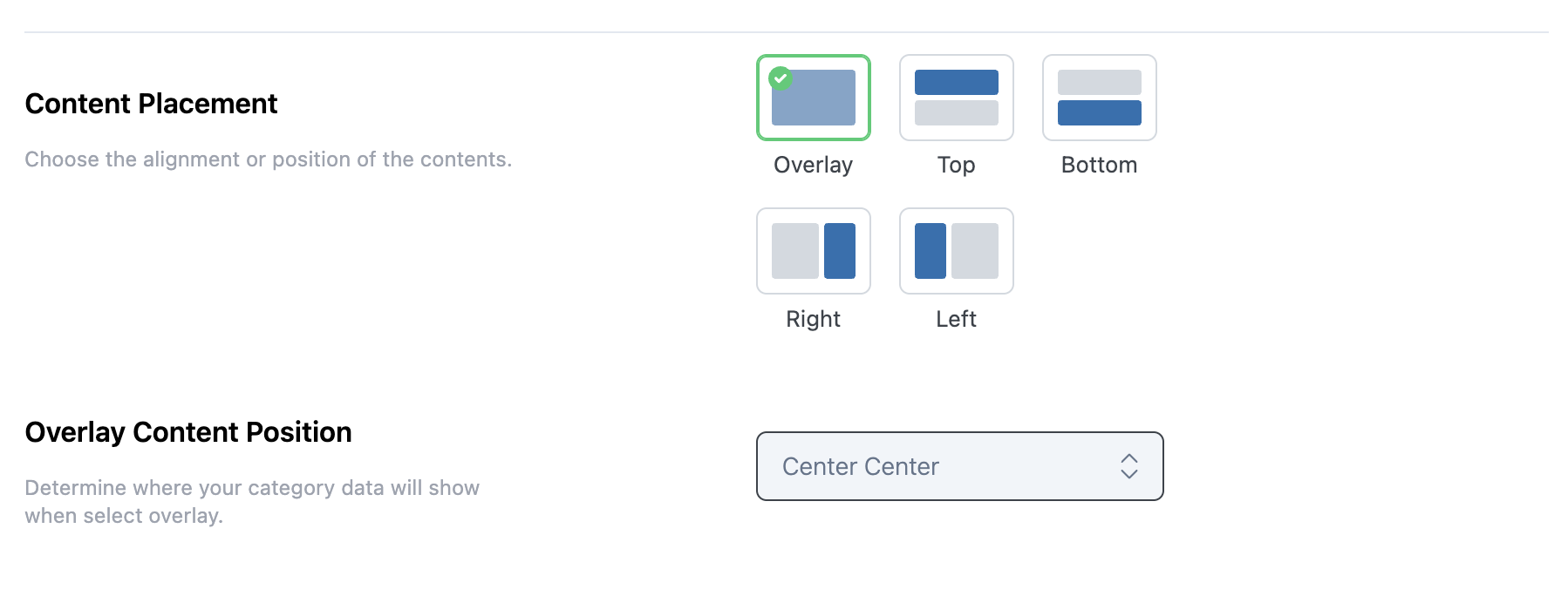
Content Placement
Choose where the content appears on each card. Options include Overlay, Top, Bottom, Left, or Right.
Overlay Content Position
When using the overlay option, select the exact placement for text and buttons, such as Top Left, Center Center, or Bottom Right.
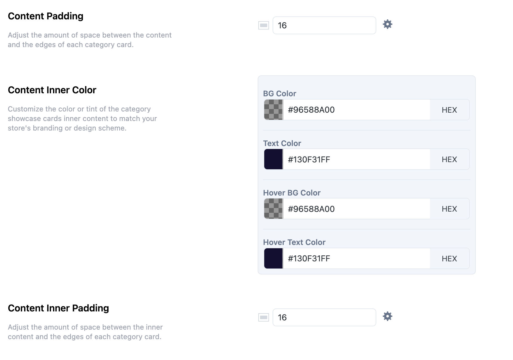
Content Padding
Set padding between the content and card edges. Use the settings icon to control each side separately.
Content Inner Color
Choose colors for Background, Text, Hover Background, and Hover Text within the content area using the color picker or HEX codes.
Content Inner Padding
Adjust the inner padding of the overlay content in pixels, with the option to control each side independently.
Next Step
Once your Showcase design is complete, continue to Showcase Display Settings to configure layout behavior and additional display options.