The WC Variation Swatches plugin allows you to visually enhance the product variation options on your WooCommerce product pages. This guide will walk you through the steps to create visually appealing swatches (like color, size, or image swatches) for your product variations using the free and pro version of the plugin
Step 1: Navigate to the WC Variation Swatches
- From your WordPress admin dashboard, navigate to Products > WC Variation Swatches to configure WC Variation Swatches.
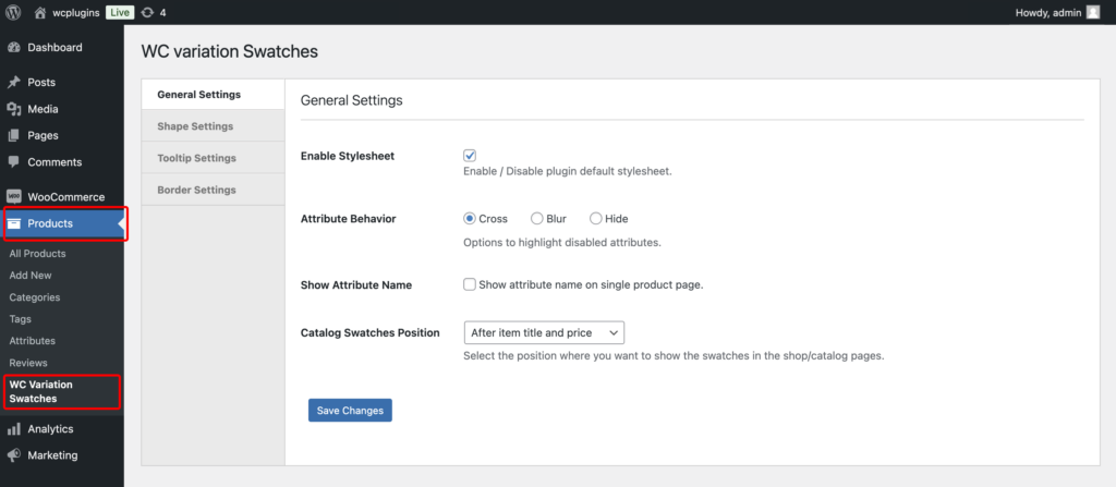
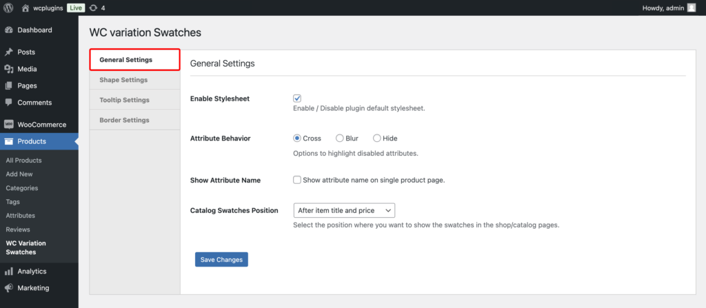
Step 2: Configure General Settings
- Enable Stylesheet: This option enables or disables the plugin’s default stylesheet. If checked, the plugin will apply its styling to the swatches. If you prefer to use custom styles or integrate with your theme’s styles, you can disable this option.
- Attribute Behavior: Defines how disabled or unavailable product variation attributes are displayed on the front end.
- Cross: Adds a cross (X) mark over the swatches that are unavailable.
- Blur: Blurs the unavailable swatches to indicate they cannot be selected.
- Hide: Completely hides unavailable swatches from view.
- Show Attribute Name: If enabled, this option will display the attribute name (e.g., “Color,” “Size”) on the single product page alongside the swatches
- Catalog Swatches Position: This option determines where the swatches will be displayed on the shop or catalog pages. You can choose between
- After item title and price
- Before item title
- After item image
Choose the option that best fits the layout of your shop.
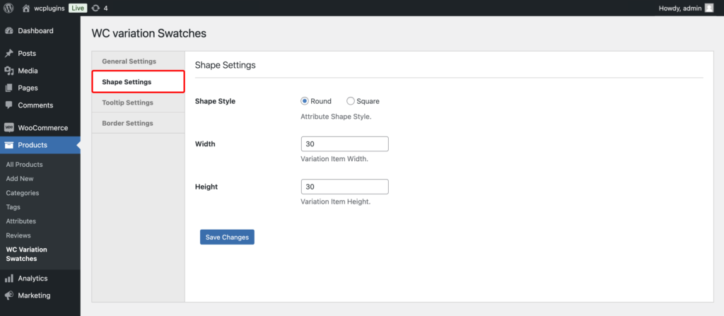
Step 3: Configure Shape Settings
- Shape Style: This option allows you to choose the shape of the variation swatches. The available styles are:
- Round: Displays the swatches as circles.
- Square: Displays the swatches as squares.
- Width: Here, you can set the width of the individual variation items in pixels. The default width is set to
30, but you can adjust this value to match the design of your product pages. - Height: Similarly, the height of the individual variation items can be defined in pixels. The default height is also
30, but you can customize this to ensure consistent sizing with the width
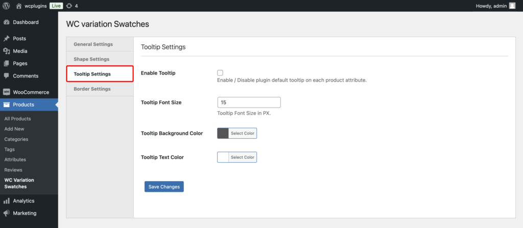
Step 4: Configure Tooltip Settings
- Enable Tooltip: This option allows you to enable or disable tooltips for product variation attributes.
- Tooltip Font Size: Set the size of the font for the tooltip text in pixels. The default value is
15px, but you can adjust it to match the design of your store. - Tooltip Background Color: You can customize the background color of the tooltip. Click the Select Color button to choose a color that complements your site’s design.
- Tooltip Text Color: Set the color of the tooltip text to ensure it contrasts well with the background color. Use the Select Color button to pick a color for the text.
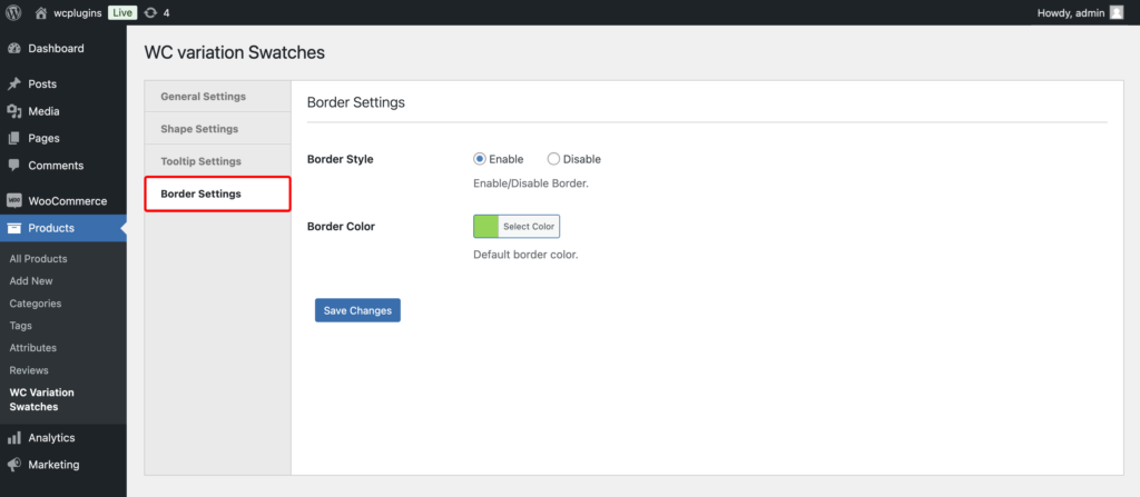
Step 5: Configure Border Settings
- Border Style: This option allows you to enable or disable borders for product variation attributes.
- Border Color: Set the color of the border color to ensure it contrasts well with the background color. Use the Select Color button to pick a color for the buttons.
Step 6: Finalizing Your Customization
After customizing the settings, ensure your changes are saved by clicking the Save Changes button.
